

Breaking UI Changes
I think some apps I use every day, like Spotify for Desktop or YouTube TV, are being way too careless with seemingly small UI changes. It starts to annoy me a lot, so I put together some examples of sloppy and irresponsible UI changes that I noticed in Spotify and YouTube TV to make you think twice before making such careless changes in your apps.
In software development, we often talk about breaking changes: when we make changes to our code that might cause other systems to break or force them to adapt. We try to minimize those changes because they’re super annoying for the people using the software, and we want everyone to have a smooth experience. But when it comes to UI design, the idea of breaking changes rarely comes up.
The apps I use every day are part of my routine. Over time, using them turns into muscle memory. The design becomes the interface between me and the machine. I rely on that interface. But it more often feels like some apps make changes that look minor, but have a huge impact on my routine and muscle memory.
Spotify for Desktop
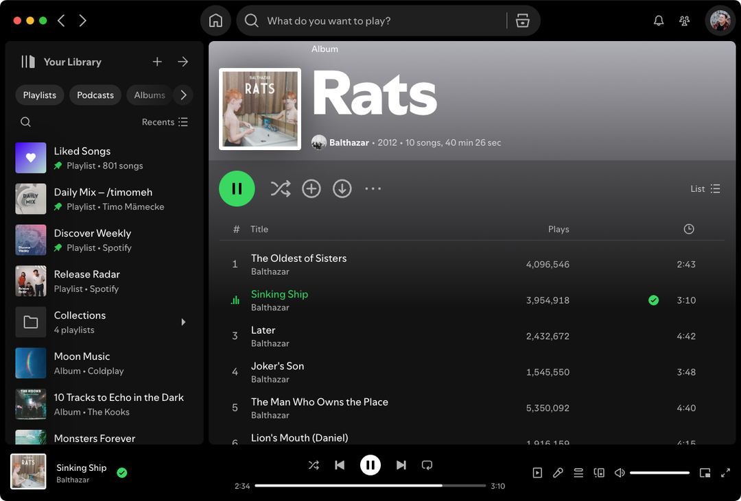
Spotify, oh Spotify. What are y’all even doing over there? Spotify for Desktop has made some seriously bizarre choices with their user experience for no apparent reason. It feels like they’re sometimes just making changes for the lulz, when they’re trying to reinvent common design patterns for desktop. Honestly, I could write a whole blog post just about all the weirdness in their UI/UX. For example: this new filter-based navigation in the library sidebar—what even is that? But I wanna talk about one change in particular.
Something happened a few months which annoyed the crap out of me: they moved the “Home” button from the sidebar to the top of the app.
Since 2014, the “Home” button (or “Browse,” as it was called back then) was always the top item in the sidebar. I checked—it’s been that way for a decade. Clicking the first item in the sidebar was muscle memory for me. I didn’t need to think about it; my hand just did the thing. This was a real no-brainer.
But then one day, a few months ago, I opened Spotify and clicked on the first item in the sidebar like I always do. Except now, it triggered a click on “Your Library”, which collapses the sidebar.1 At first, I didn’t even visually see that something had changed, I just felt that something was off. All I knew was that this isn’t what usually happens.
Maybe this confusion only lasted 30 seconds, but it felt like an eternity during which I stared into my screen like a monkey, not knowing what I’m supposed to do.
The gist is: this change was completely unnecessary and careless in its execution. It looks like a small design change, but it’s a huge breaking change in the way I use this app. Even months later, I still struggle to find my way through the Spotify app.
Footnotes for Section Heading
- Footnote 1: Big LOL btw on this feature. ↑
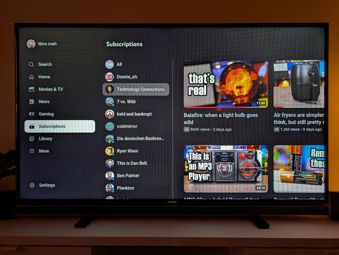
YouTube TV
I use the YouTube app on my Google TV on a daily basis. Its design is clean, sticks to simple UI conventions, and has no unnecessary bells and whistles—which is especially important in this case, because you’re using this app with a remote control!
A remote is a very interesting input device because, unlike a mouse or touchscreen, you can use the remote faster than the UI can keep up. If you know the layout and where you want to go, you just press the buttons quickly and let the UI catch up.
When I’m watching a video and want to go back to my subscriptions, I have my very own Konami Code ingrained into me: ← ← ↓ ↓ ↓ ↓ → →.
- Two times left to get into the sidebar,
- four times down to go to “Subscriptions”,
- two times right to get into the list of videos.
But a few weeks ago, I suddenly kept ending up in the library screen instead of my subscriptions. You know, that screen where your watch history and playlists are—not where I often want to go. It took me a few hours, maybe even until the next day, before I realized that they had swapped the positions of “Subscriptions” and “Library”.
Now, to go into the Subscriptions feed, I had to press down five times instead of four. A completely unnecessary change, done without any care. Especially on a TV, these kinds of mistakes always feel so “expensive”. (Maybe because of the latency and the lack of an app frame?)
And just as I was getting used to the new key sequence, YouTube apparently realized that it was a stupid change and reverted it. Which meant that I now again started navigating to the wrong screens all the time, and again had to re-train myself. What an utterly useless and frustrating experience.
Generally, YouTube TV fucks around a lot with the navigation. Most of the time, they don’t even change the order of elements, and instead change which element gets the initial focus!
For example, when you’re watching a video, pressing up twice used to focus on the video title (where you could view the description). From there, pressing right would take you to the channel.
Now? The initial focus is on the channel! But wait, it get’s even better: in a recent update, there’s now a new “Subscribe” button on this screen that gets the initial focus.
But now comes the best part: You would think that this button is shown if you’re not subscribed to the channel, except when it’s not! The “Subscribe” button is sometimes there, and sometimes not, even if you haven’t subscribed to this channel. Is this a bug? A feature? At this point, why not both!
Breathe, Timo.
Seriously though, all of this—and many more similar experiences—makes me think that some people with decision-making power just aren’t considering the consequences of their changes. This stuff matters a lot. It alienates me as a user. The fact that YouTube reverted the swapped menu items suggests they got enough negative feedback to come to the conclusion that it’s not an important enough change.
Design isn’t just about making things look pretty. If breaking changes are treated with caution in code and are discussed so often, why aren’t they in design?
Comment: [email protected]
.jpg)
.jpg)